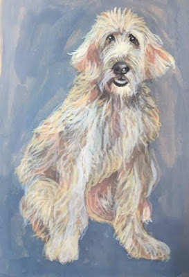
I did not capture any of the sketches or early layers of gouache to paint Ginger. You'll notice that her background is very uneven, which initially bothered me. Once I added her fluffy, whispy fur, however, the background and texture of the dog seemed to be much more harmonious.
One of the things I wanted to experiment with with this paint AND paper is using the paper as a middle-tone value and playing that tone into the creation of the image. Because you do not have access to the layers in the development of Ginger, it is easy to forget (or not even thing about,) the fact that Ginger is painted on tan paper, and not white paper. Allowing some of the tan to peek through the whispy grey, pink and lavender hair strokes, softens the overall appearance of the dog which would not be possible to do in this way were she painted on a white ground.
Going into the highlighted areas and adding 'almost white' to the surface, give more texture and depth the the dog's coat that if it were on white paper, as well.
Being able to used a toned paper in this way was one of the 'selling points' emphasized by the Strathmore artist. Well, I guess it worked, because I was anxious to push the paper and gouache using the tan as a mid-tone, AND I like the end effect. I still think the background would look better, had I worked it more, but.......it's a learning painting, and I discovered a nice effect using this paper!
Another dog image is coming.......keep in mind that from all of the Chicago pictures, many include dogs, but I have not seen one cat, rabbit, ferret, etc........perhaps dogs were the only critter allowed?????


No comments:
Post a Comment