Foraging for a Meal

Foraging for a Meal
Foraging for a Meal at 30 below!

Friday, July 31, 2015

Swimming Otter #2

It is amazing how the addition of the beginning of the otter's body brings a lot of this chaos into focus.

Otter addition - layer #1.  Lights, darks and a face. Acrylic on Gessobord, cropped.
The planning, ahead of time, to align the "wake" created by the fast-moving otter with the wave patterns in the water and reflected light has helped this work for me.  I tried to strategically place the rock colors, as well, so that there would be contrast for the tail and body and more subtle proximity with the light facial hair.

Once again, the slickness of the otter's coat needed reflected light right away to help define the contour of the body.  It will require more reflection and water movement to work.

More reflected light, ears back and bright eyes, plus the tail in action to steer the entire animal, just like a fast moving ship.  The power of all four legs stays under the water all of the time.  Acrylic on Gessobord, cropped.


A little splashing water and more water action, and she is good.....done! Acrylic on Gessobord, cropped. 
This was a good study in reflected light and moving water.  I would have to do more practice work if I were going to tackle an image like this on a larger canvas. 

Thursday, July 30, 2015

Almost ready for the otter.

This painting is another example of layering.  The rocks are on the bottom and sides, covered by the depth of the water, then the surface waves, ripples and reflected light.

First 3 layers.  Acrylic on Gessobord.
I was challenged by both stages of this painting at this point.  The lines seem too random because there are multiple surfaces bouncing off both the wave actions from light and water. 

The surface layer that includes reflected light and wave shadows is now ready for the otter. Acrylic on Gessobord.
I really want to make a visit to the Minneapolis Institute of Arts to explore how artists, especially the Impressionists, have represented water movement and light reflections! 


Wednesday, July 29, 2015

Establishing the Swim Tank for Otter #2.

The pictures provided a great reference for the colors I wanted to use in the Otter #2 painting.  I began by laying in the rocks and the structure that held the water.

Acrylic on Gessobord - There are so many rocks in this small space that an active otter creates lots of waves. 
The lighting in this painting was tricky.  The boulders on the bottom, one side and the back wall of this tank bounced both light and water in multiple directions.  Below is just the reflected light of the bottom rocks.

Portion of painting - bottom rocks.  Acrylic on Gessobord, cropped.
The only portion of this painting that is not submersed in water is the rocks on the right side of the tank.  They are most visible in the upper right hand corner of the portion of the painting below.

Dry rocks on the right hand side of the painting.  Acrylic on Gessobord, cropped.
Below is the combination of the light reflected off of the angled rocks on the bottom and two sides, the water bouncing off of the ripples, and the shadows created by the rippling water, mini-waves and, of course, the otter. Phewwww - lots going on!
Because of the small space and the high activity level of the otter, there is a lot of action in this water.  Acrylic on Gessobord, cropped.  Click on image to enlarge. 

Tuesday, July 28, 2015

Otter #2 - Sketches

The view of the second otter was taken from the narrow end of the tank.  The second otter was swimming toward me.  The water was so turbulent that it was not possible to see parts of the otter under the surface.


Pencil sketch on tan Strathmore sketch paper.  The movement of the ripples in the water will be important in this painting.  Capturing the reflected light will define the water movement.

Because of the lighting in this habitat, the movement of the otter was created by the reflection of the light off of the water, rocks and otter and not the bubbles in the water.  This point of view was more challenging for me the the "profile" view of Otter #1. 
6B pencil on tan Strathmore sketch paper.  Otter swimming toward me. 


Monday, July 27, 2015

Otter Photographs

The photograph below provides a source of information for a submersed otter.  It is particularly helpful for the reflection of light off of the swimming otter AND for the location, size and pattern of the bubbles. 

Swimming otter - Duluth Aquarium
Otter sisters - Duluth Aquarium
The next picture provided useful information about the texture of the wet and dry otter.  The sister in the foreground has just gotten out of the water.  Notice how shiny her cot is, and the hairs appear to be lying in groups, as if combed with a gel or oil product.  The way that she is sitting, it is hard to gauge the length of the tail, but the body looks compact, with a rounded belly....very different when in the water, swimming.

The facial and body hair of the sister in the background is a lighter color.  She has not been in the water yet so she is dry.  Her coat also has a sheen, but the hairs do not appear to adhere to each other - a fluffier look.

Otter sisters prior to going into the water.
The third picture was taken before other otters went into the water.  It has provided a great source for color and fur texture.  Notice the colors in the next blog as they relate to this photo. 

Sunday, July 26, 2015

Pattern and Size - The action is all in the bubbles!

Not only do highlights and shadows play an important role in defining the motion of the otter, I realized that the location pattern and sizes of the bubbles are equally as important. 

I noticed that the smallest bubbles, for the most part, were almost rolling off of the otter and were the ones that appeared to be coming from within her fur coat.  The trajectory of these bubble pathways left a trail indicating where she had most recently traveled. 

The larger bubbles were further behind her, also on her traveled path, but appeared to be conglomerate masses, formed by the smaller renegade bubbles, released earlier. 

Acrylic on Gessobord - "Otter in Motion!"
These bubble characteristics, including highlights, shadows, patterns and size location really helped define the otter's movement and create motion in the small painting.  I feel like these elements combine to capture the essence of this otter.

Now, on to the sister from a different angle. 


Saturday, July 25, 2015

Reflection and Volume

I began to further define the volume of the bubbles by giving each a bright side and a shadow side.   I took a little side trip to add more details to the otter, herself.  She needed whiskers, in motion, to help create movement, and additional tones of reflected light, to create texture and volume. 

Acrylic on Gessobord.  Click on image to enlarge. 
An interesting sidenote is the color of the water.  While all of the aquariums in Florida that I have visited emphasize flora, fauna, and general water attributes as predominately aqua and light blue, this aquarium favors browns, rusts, teals and yellow-golds.  If you think back (or click back) to the moose painting, the rocks along the shoreline are more indicative of the north shore's base element IRON; they are browns, rusts, deep blues, and blue-grays. 


Friday, July 24, 2015

Swimmer in motion!

 I continued experimenting with darks and lights in the water and on the otter, prior to moving my attention to the bubbles that really defined the motion.

Acrylic on Gessobord. 
 I didn't realize how elongated otters become when they are swimming fast - WOW!

Although the hind feed look very dark, they also reflect a lot of the light from the surface. 
Without the air bubbles, this dynamic swimmer is just a curlycue in the water.  It's almost as if the air bubbles emerge from within her coat and from under her belly as she swim downward.  They are so large, compared to you would see in a swimming fish, or reptile, that I really had to study them to know how dense to make them.

In contrast to the surrounding greens, aquas and purples of the water, the bubbles appear to be a silvery-white - lots of light bouncing off of these! 

I think it is the shadows cast on the interior and bottom of each bubble that will help define it's light reflection and volume; that's tomorrow's task!

Thursday, July 23, 2015

What a swimmer!

While I was visiting the aquarium in Duluth, an announcement came blaring over the speaker system, inviting museum-goers to the daily otter show and feeding.  I made my way to the first floor to learn more about the otter sisters, watch their swimming maneuvers, and sketch a few quick-images for later use.

She exudes curiosity as she stretches out to race through the water.  6B graphite pencil on tan Strathmore sketch paper.  (She needs whiskers that show the pressure and direction of the water flow.)


The tail flattens out and takes on a two-fold function:  rudder and power flipper.  6B graphite pencil on tan Strathmore sketch paper.

I actually liked the fluid motion of the quick-sketches in yesterday's blog and the two above, so used them , to begin my small painting of one of the otters.   The reflected light plays such a key role in not only defining the hard edges inside this aquarium, but also in defining the texture of the otter's coat; it looks almost oil-saturated when she is wet, whether under or above the water. 

Acrylic on Gessobord.  Otter in the deep end of the tank. 

I will continue to experiment with the reflected light.  I do not want to complete lose the color of the otter, however.

The extended body shape of this rapid swimmer helps define her action under the water.  I think my next addition will be the air bubbles that she pulls with her, that help define her motion. 


Wednesday, July 22, 2015

When to stop -starting another...

You may remember that one of my challenges is knowing when to stop working on a painting.   Hmmmmm.

You may have noticed on the most recent painting of the moose,  several small items have changed in the past couple of posts.  The neck-piercing tree branch in the background is gone, for example.  Characteristics and lighting of the grass in the creek-side meadow have also changed.

I think I am going to stop working on the moose, at this point, and study this painting for a while.  I may be "done," but would like a little think time before I make that final decision.  In the meantime, I will be moving on.

Below is a quick sketch of an animal that is very entertaining to watch.  I think, as humans, we try to personify these critters to better understand their antics.  I am not sure they are as fun-loving as we project, but it does appear that they really like new challenges and problems to solve and get irritable or crabby with one another when their tasks or environment become very routine....well, that sounds pretty human, speaking of personification!!!!

Black micron pen on placemat, approximately 4" x 6".  Not exactly a Toulouse-Lautrec image, but certainly a tribute to his style, (and there were no dancing women OR drinks.... not in France, either.) 

Tuesday, July 21, 2015

Yep, it's definitely water................

A portion of painting: acrylic on canvas.  Creating the stream layers.
As I decided earlier, this moose will be quite light in color.  I have continued to layer the colors, creating more contour and texture with each layer.  I think I will stop with the addition of the beard, and move to decisions about the "ground" under the moose.

I decided to add some shoreline shadows, mid-stream rocks, and a few water characteristics and see if water is the way to go.  Water seems to be so much more "moosey" than gravel when looking for moose-like habitats.


I decided to continue with the water-work, keeping in mind that while acrylic is not forgiving, it is changeable.

Adding a few more attributes of water, including the ripple lines at the shore.

In addition to adding water attributes, this step involved two major decisions. 
The first major decision was water-depth.  If I made the water too deep, a lot of the leg images of the moose would be submerged.  If the water is too shallow, it will not look very inviting for a moose.  Since the moose is placed fairly near the rocky shoreline, I decided the water should be around a foot deep.

The second decision was about the clarity of the water:  clear, semi-transparent, or murky?  If I were attacking this painting in a different way, the hooves of the moose would not be complete at this point in time, but since I am approaching this painting in layers (of course the moose was originally going to be standing on gravel, )  I would like those to be visible.  I am going to proceed planning to place the moose in a foot of transparent of semi-transparent water that is moving slowly. 
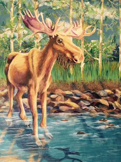
Next decision:  where is the viewer.
I would like the viewer to be on the right-hand side of the moose.  In the wild, I think this would be a more logical location because the moose could more easily make an escape to the left.  If the viewer were in the middle, center of the canvas, the moose would need to charge to escape in any direction, making the image more about confrontation than observation.  I realized that the refiection I added in the painting above are in the right location, but WAY too rigid to be in flowing water - even if the moose is very statuesque.
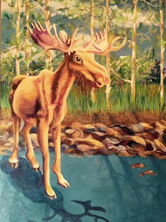
Yep, it's water!
 I went back into the reflection to give the moving water more influence on the image.  I think it is more accurate than in the prior image - I will continue to think about this one. 


Monday, July 20, 2015

Moose - Lights and Darks

Since I have already made the decision to keep the colors of the moose on the lighter side of the species, the challenge will be to create strong shadows and highlights within the middle range.  That will allow for a few extreme darks and lights to help the moose be more three-dimensional.  Since the trees in the far background are primarily dioxazine purple, it makes sense to being the moose shadow work with the same color for shadows and contour.  See the beginning of what is sure to be a many-layered process, below.

Blocking in lights and darks in moose layer #2 (remember, layer #1 is "Ghost Moose.")  Click on image to enlarge.  Also notice I will continue to tweak the rocks in the background, the grass, and ....I have to do something with the piercing tree branch!

I need the antlers and ears to have definition and contour right away.  The lightest portion is white with burnt sienna and the shadowed portions are diox purple with white.  Notice the addition of purple for the darker shadows on the body and the "beginning of the end" of dagger branch.

...and so the layering continues. 

Sunday, July 19, 2015

Ghost Moose Stand-in


I have tentatively made a decision about the placement of the moose.  I won't be able to include a complete shadow of the antlers, but have always like taking an image outside the edges of the canvas, so....what else is new.  I quickly blocked in a watery ghost moose to see if the placement is still OK once it is more tangible.  If I get it wet enough, and scrub a lot, I can probably still remove it without redoing ALL of the background layers......

Ghost moose enters - needs the shadows to make a final decision!

I think this will work AND it's looking like water - although that means I will have to decide the depth of the water that the moose is wading in AND if the water is transparent, semitransparent, or murky.....decisions, decisions!!  AND then there is the decision, when using water, about the location of the observer because it will influence the location of the reflections.....yep, decisions, decisions!

Is this placement the one that you picked, or was it one of the others?  I have a tough time deciding, and thought about it way longer than I probably needed to! Afterall, it is JUST a painting!!!

Saturday, July 18, 2015

Moose Supervisor

While I continue to agonize over the placement of the moose in my painting, I have adopted a new studio supervisor.  He is the broody, quiet type, but is constantly chewing - OK - in theory, he is constantly chewing.

Studio Supervisor

Friday, July 17, 2015

Moose moves in.....but where???

OMG, I apologize if this is starting to feel like the "Moose Soap Opera."  Keep in mind, the drama is limited,  there is no love triangle, sex, or organ-simulated music.  My intent is just to take you along with me on the journey. 

Although I have not made a final decision about whether or not the foreground will be water or rocks, I am still going to experiment with moose placement. 

I began by placing the cutout very close to the boulders.  The moose neck blocks my favorite background pines AND birches, and the branch that looks like it's piercing the moose's neck would have to go.  On to try #2.  

A little more central and all the way to the forefront.  Downside - no room for that beautiful antler shadow.  Upside, the background trees are more visible.  Next........

Try #3 - The moose's hind hooves are dancing on the rocks - not a very stable location for any foraging moose.  I like the placement a little more to the center, however.  There is not enough contrast between this cut out moose and the lodgepole pines, however.  Good rational NOT to have an albino moose!    I do like this size for the moose, however....that's a keeper.  Next.....

Size is good - how about location?  Is there room for antler shadows?  If the sun is center, top, the shadows of the pines would have a sunburst effect in the shadow, as well.....HMMMMM....
So, what placement appeals to you? 

Thursday, July 16, 2015

About the Moose.........

I really can't go any further until I make some decisions about the size and placement of the moose.  Since I am doing this painting in layers (and would really like to avoid multiple paintings of multiple layers,) I want to decide on the moose layer before I continue.   

In a previous painting, I decided to bring the white pelican (that was flying next to our boat,) to the forefront.  The size and location of the bird is somewhat unusual and I would like to explore this effect further.  So what might that mean for "the moose?"

A portion of the "White Pelicans" painting, acrylic on canvas.  Reference photograph taken in Sanibel Nature Preserve, Sanibel, Florida.  Click on painting to enlarge.  (Reminder that this is a copyright protected image.) 

Although I watched for moose during my art exploration in Grand Marais, I didn't see any that were living.  (Liz brought a great skull to class, however, which helped me realize the massive size of these majestic animals.)  Although online references can be useful, I am always mindful of intellectual properties concerns and copyright.  The Duluth Aquarium provided a nice visual reference to a moose, and one that was more "fair haired," as well.  In hind sight, I should have completely circled the display, but instead explored the lighting the emphasized the antlers in the shadowing. 

Duluth Aquarium native animals display, Duluth, Minnesota

I decided to start with a separate sketch of a moose so that I could experiment with size and placement.  I used 11" X 14" Strathmore bristle paper so that it would keep some form once it was cut. 

As with many of my animal depictions, my sketch reveals more animation than the "almost real" version.  Stay tuned, because color and lighting will only serve to increase this quality. 

Once cut out, I could manipulate the stance and appendage angles somewhat simply by cutting the moose apart and repositioning the parts.  If you look carefully on the moose image above, you will note the masking tape where I have done this several times.    Next, to the painting.

Wednesday, July 15, 2015

Needs Boulders!

Everywhere you look on the North Shore along Lake Superior, you are reminded about the ruggedness of the terrain.   Edges of the roadways are lined with rust and prussian blue gravel and rocks.  Within ten feet on the northern side of many passages, are rock sheers.  The massive sheets of rock are tilted to remind all who pass that the glaciers  were bigger still, and dragged a lot of debris with them as they melted.  Frequent rivers, waterfalls, and raging streams also serve as constant reminders that all who go there, human, animal, plantlife, etc. must be tough to endure. 

Well, all of those reminders are screaming, "add boulders, add boulders!"  So, here goes.....

I started by laying in some darks and reflected lights.  (The foreground is looking more and more like water all of the time, isn't it?)  

Starting to define some of the boulders.  Click on the image to enlarge. 
I want the edges of the boulders here to show the stratified layers and fracture lines so characteristic of North Shore roadside and shoreline rocks. 


Tuesday, July 14, 2015

Leaves and Gravel - framing the background

As I drove by each of the roadside clumps of planted trees, the features that were consistent included the dense foliage at the top and the starkness of the trunks in the middle. 

The grove of trees is taking on a more realistic quality - still needs more leaves at the top.  Click on the image to enlarge.

In addition to the density of leaves at the top, the grass at the foot of each tree helps further define the trunks and the overall space the trees occupy.  The golds and rusts in the gravel at the bottom help warm up the overall tone and could be "moosey" shades.

Since I was driving on either blacktop asphalt or concrete, I also had the advantage of using the curbing, roadbed, or drainage ditches to define the bottom of each grassy meadow containing the trees.  So far the dominant colors in the background are based in blue - cerulean and prussian, with the addition of red, yellow, ochre, and/or white.  I am going to add additional tones to the foundation of the trees to pull in the colors of the moose I intend to add later.  As with the potential addition of trees, I can always change these colors later - the beauty of acrylics!

Although I had originally intended for the bottom third of the painting to be boulders, rocks, and varying sizes of gravel, a discussion with Tom and Sarah over dinner has helped me rethink this portion of the painting.  
 As we walked to the waterfall pictured in the beginning of this blog, we kept a keen eye out for moose.  Meadering brooks and streams leading to the rapidly raging river provided a good reminder that moose hang out in water.  I think I will complete my sketch of a moose, cut it out, and move it around on the canvas to consider gravel/rocks vs. water. 


Monday, July 13, 2015

Expanding the Grove

My reference pictures include a mini-forest of trees that appear to be planted in pseudo-rows.  Because these trees bordered the roadside, their primary purpose is probably intended to be wind and snow breaks.  I am most interested in the backdrop of the light color of the tree bark throughout the trunk of the trees, and the way the shadows of the leaves play off of the trunks.  I do plan to put a moose in the forefront of the painting, but am not interested in course, blackish-brown coat of the senior male moose population.  Although it could create a strong contrast of lights and darks, artistic license suggests the moose could become an inky blob that dominates the entire canvas. 

For now,I'll be adding more trees and I will do a sketch of a moose on bristle paper to cut out and use as an aid in moose placement.

I have started with the addition of two more trees.  the addition to the left is deliberately larger in diameter to bring it forward in the grove.  The lower branch may be a problem later, but for now I like the way it helps frame the birch stand in the distance.  

Continuing to add more leaves and grass.  I keep reminding myself about the importance of keeping the central tree trunks very sparse. 

Originally I planned to paint a dozenish trees to set the backdrop, but now feel that I would complete lose the distant images that include the sky, clouds and two layers of trees and brush.  For now, I think I will move forward by addition additional leaves at the top and some texture to "ground" this layer (OK, pun intended.)  I can always go back and add more trees later if this grove doesn't create a sufficient setting.