Foraging for a Meal

Foraging for a Meal
Foraging for a Meal at 30 below!

Saturday, October 31, 2015

Happy Halloween!!

Dave has established a wonderful Halloween tradition at our house that is very different than other families in our neighborhood.   The afternoon begins with his trip to the meat market to select chicken thighs and pineapple bratwurst, no casing, to put on the grill.  Well before sunset, he begins warming a couple of his grills and plans for the evening grilling schedule.  The timing of the addition of barbecue sauce is an important part of the planning.

As trick-or-treaters come to add to their candy collection, Dave has skewers, bowls, forks and napkins ready to serve "treats" to the accompanying parents.  Veterans of this tradition come prepared to sample at least one of everything, while those new to the parent trick-or-treat grill are usually much more timid.

Over the years, we have enjoyed several seasoned trick-or-treat visitors who are traveling childless.  A few have claimed to have children, or recall a trick-or-treating event while accompanying costumed children, but most seem comfortable warming their hands near the grill and making selections from the choices inside.

For Dave, this evening always ends too soon.  As parents head down our driveway, their step seems to be lighter, and they seem to be in better spirits than on their approach.  Could be manifested as a figment of the night's aura, or perhaps the grill adds an anti-gravity spirit on just this one evening.  Whatever the reason, Dave will continue to plan for the next October 31st parenting event in our neighborhood!

I hope you find or plan something high spirited and unexpected for your Halloween festivities to keep friends, family and/or neighbors smiling!

Happy Halloween pumpkin - Black Ranger permanent ink on gessoed tan Strathmore paper.  Color added with Derwent Intense pencils activated with water, and green Sharpie permanent finepoint marker. 

Quick reminder:  Time will FALL BACK tonight!  Change your clocks!

Friday, October 30, 2015

Mixed Ink Color Experiment

For a small run of prints, I like this process of printing and painting.  Between the carving of the block, the inking, printing and hand-painting of the image, it maintains the creative process enough to keep me happy, but I don't think I will last long with the repeatative process unless there is somethink very different about each final product.

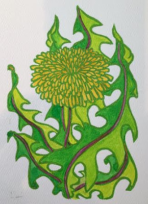
Dandelion print, in process - Mixed Daniel Smith green ink, and FW acrylic inks on 300 series Strathmore paper. 


In the early days of printing, this process was still quicker for most people than hand drawing and painting each individual image.  It allowed a master craftsmen, in a studio filled with apprentices (or with even one apprentice,) to create the initial image, and move on to create the next original image, while someone else could even carve to block or plate, ink it, check with the "master" with the proof, then ink x-number of copies.  If color was needed, the original artist did not really have to touch the work at all, but could also  apprentice-it-out.

Dandelion print - Mixed Daniel Smith green ink, and FW acrylic inks on 300 series Strathmore paper. 

The part of printmaking that is ironic to me (if that is the right descriptor,) is that a block print printmaker can hand print 100 images of the exact same think and each one is considered an original.  If I take an original painting to a printmaking studio and have them print multiple copies, only the first painting is considered the original.  If I want to enter a piece of art into a show, only the original painting can be entered in the painting to print scenario, but print number 86 can be entered in the block print method.........hmmmmmm. 

Thursday, October 29, 2015

Changing Ink Color

The tone of the tan paper helps to convey the rustic, natural sense of this image - it is keeping with the Durer quote at the header of this blog.  I decided this would be a good time to try a printing ink other than black and see if it could create a softer, more natural image BUT with the ability to include a range of darks through lights with the addition of the FW inks.

Dandelion print with green ink - Daniel Smith relief ink on tan Strathmore paper.  FW acrylic inks added. 
The first challenge was to mix the right color ink from the 5 initial tubes I bought (cyan, process yellow, magenta, black and white.)  I started with a very basic mix of cyan and process yellow.  The resulting green seems too light to me now, but seemed like a good start at the time.  The tan paper just isn't working for me, however, so I shifted to printing on white paper while my ink was still tacky and rollable!  I also added a little black ink to the goo to get a more "dandy" color. 

Dandelion print - Mixed green Daniel Smith relief ink, and FW acrylic ink on Strathmore 300 series print paper. 
After letting the green ink dry overnight, I was very pleased with how little it was activated by the addition of the yellow acrylic ink.  My experimentation is far from over, but this ink may have the properties that I am looking for!!!!


Wednesday, October 28, 2015

Color is Dandy.....

Remembering the importance of using the tan tone of the Strathmore paper as a middle tone, I wanted to eliminate the influence of the tan with the addition of color.  To achieve this goal, I decided to gesso the tan paper and start with a white ground for printing. 

         Dandelion print with color - Black Speedball relief ink, on gessoed tan Strathmore paper.                                                  Color added with FW acrylic inks. 
I continued to print with the black Speedball ink, but used a hair dryer to try and cook the black ink into the gesso in the hopes that it would not be water soluble.  Although not tremendous reactive to water, the ink did move some when touched by the FW ink on a brush.  I tried to work very carefully to bring the brush just to the edge of the printed ink like, but not to cross it.  The end result was close to my expectations, but the process was far more tedious than I had hoped for. 

I think there is some potential here for using this process with a card or small framed image.  The writing around the edges forms a border, of sorts.  I am not sure this would work in the same way if it were printed on a white background....remember, this is tan paper with gesso added as a ground prior to beginning the printing process. 

Happy Birthday Claude Edwin!!


Tuesday, October 27, 2015

OMG - It's NOT a Shoe!!!!

When I worked in a graphic arts shop a million years ago, much of the work being done revolved around alignment of register marks, buttons and tabs to align multiple plates for four-color printing.  The idea of mixing primary colors and dot patterns to create the entire color spectrum of color became intriguing to me from that point in time.  The part of the process I did not fully realize until much later in my printing journey was the diverse properties of different inks.

Breaking down an image into it's color components adds a different aspect to the process of artistic production - one that is very mechanical and not necessarily creative - at least the way I think about creativity and the creative process.  That is partially why I have decided to print all of my current prints in one color, and add color manually after the prints have dried.  I was surprised to discover that there has not been a relief print ink designed specifically for this purpose since all of the inks I have investigated to this point in time remain water soluble long after the prints appear to be dry.

One way I have worked around this challenge, to some degree, is by using the printing ink closest to the dominant color I want to "flavor" the final image...well.....easier said than done.  Since I enjoy complimentary colors in a single image, printing with a dominant color does not always allow me to have the contrast I desire in the final product.

The dandelion, first designed for a friend who loves to pull weeds, provided the opportunity to experiment with a couple of different printing colors.

Dandelion print - Black Speedball ink on tan Strathmore paper.
I started with a proof print using black Speedball ink on tan Strathmore paper.  I think the implied overlap of the images helps create dimension.  Hand painting will allow me to add shading and highlights that printing in a 4-color separation style would not allow.


Dandelion print - Black Speedball relief ink, white China marker and 6B graphite pencil on Strathmore tan paper. 
Quickly adding some white China marker highlights and pencil (which appears as gray shading,) helps me see the dimensional aspect of the print.  I have to remind myself that if I am going to be printing on these toned papers, such as the tan (Strathmore also has a gray,) that the color of the paper serves as a middle tone.  Forcing myself to think about the role of the paper color is good practice for both printing AND working with pastels on toned paper!!!  It might even carry over to the process I have needed in the past when working on a black canvas...well....similar.  Obviously, the black canvas assumes the darkest element in the color pallet and NOT the middle tones.

I seldom think about the role a white canvas plays in the color pallet in the same way, and yet it is key in lights, darks and color selection!!!!  Note to self:  be deliberate about the role of the white canvas in color pallet choices and range of tones and shades from light to dark!

The addition of color to this print will be the next challenged, followed by printing in another color besides black.

Monday, October 26, 2015

One-run Wonder

I have not made multiple carvings of this image, each of which would be used with a different color of ink.  In the purist world of printing, the printer would use only 4 colors of ink when printing on white paper, and be able to create a wide range of colors with overlap, varying amounts of crosshatching and patterning, and varying degrees of transparency in the inks.

Although this is an area I would like to explore at some time, for right now I will be hand coloring the images I have printed in a single color.  This makes the ink criteria of non-water soluble once dry an essential property.

Boat/Loaf/Moc - Hand painted block print using Daniel Smith printing ink, FW acrylic inks, and gouache.  


I was pleasantly surprised at the degree of coverage the FW acrylic ink provided on top of the black Daniel Smith relief ink.  The results of the FW acrylic ink on white printing paper is much more like water color even though no water has been added to dilute the ink. 


Boat/Loaf/Moc - Hand painted block print using Daniel Smith printing ink, FW acrylic inks, and gouache.
Although image one looks just like image two, if you look closely you will see one difference.  It took me a while to realize I had painted incorrectly and had to make a correction.  Again I was surprised at the covering quality of the FW acrylic ink.  I have not used this ink much or often, but will continue to see what it is capable of doing with these prints!  Another product that is receiving lots of advertising attention is the Golden fluid acrylics.  The emphasis on their use seems to be for airbrushing, but I am wondering what kind of coverage and transparency properties they have.  It's not likely that I will personally find that out for a while - already bought the primary and secondary colors of FW - that's enough investment in exploration for me for a while!!


If you have tried the Golden fluids, I would love to hear your thoughts on the properties and possible uses!  How have you used them/

Sunday, October 25, 2015

Boat/Loaf/Moc - a new type of rendering

Last year, just about this time, we were discussing "wish lists" for Christmas.  One of the items I went shopping for was a combo between a boat shoe/loafer/moccasin, to give as a gift.  I had a picture in my mind of what I as looking for based on the chewed remains of what was being replaced.  Since it has been a while since we have had a dog, I forgot how much they seem to enjoy a tasty shoe.

Instead of drawing the image to remind the dog of what the "non-chew" item looked like, I decided to give block printing and inking a try.  In addition to giving the shoes as a gift, the picture was intended to be a pseudo-gift for the "chewer."   Below is the early proof version of my boat/loaf/moc footwear.  This carving and the multiple printing experiments that followed opened the door to a series of carving and printing explorations.

Proof #1 - Boat/Loaf/Moc block print - Lamp black Daniel Smith relief ink on Strathmore/Stevens 400 series print paper.
In college when we were printing, we spent a lot of time soaking the paper in preparation for printing.  Our paper choices at that time were tremendously limited and very expensive.  I have really been looking forward to trying this new printing paper created in a collaboration between Strathmore paper and The University of Wisconsin; Stevens Point.  They have both a 300 series and a 400 series paper.  I am going to move forward without soaking the paper because I am not printing with a high pressure press.  If you look at the first "pull" above, I need to be sure that the ink and paper are making better contact since I am not using high pressure.

Proof #2 - Boat/Loaf/Moc block print - Lamp black Daniel Smith relief ink on Strathmore/Stevens 400 series print paper. 
I applied more pressure to proof #2 and am more pleased with the results.

I am continuing to look for an ink that meets all of my criteria, including safe (no toxins or toxin-based clean-up,) stable once dry even with the addition of water, and relatively quick drying (less than a week!)  In researching inks, three names have come up over and over again, so I will be trying each to see how well they meet the criteria.  The three are Daniel Smith relief, Speedball block, and Akua.

When I was doing some offset printing in Grand Marais several years ago, they used a mineral-spirits based ink (toxins,) but instead of mineral spirits for clean-up, they used Crisco - the solid white shortening in the gallon-sized canister.  (Mmmmm, grandma's pies?????? or perhaps Sunday's fried chicken???)   It was really a mess to get from the "done with printing" phase to the "all clean and ready to go home" phase, but the exposure to toxins was greatly reduced with the Crisco - nice moist hands, as well!  I just don't want to introduced Crisco into my work space........what a mess!!!  I am very hopeful that the Akua meets all of the criteria, because it is a soy-based product. 

Saturday, October 24, 2015

The Tried and True Deck Shoe


Deck Shoes - Pencil, .8 black Micron pen and Faber-Castill Indian ink on 300 series Strathmore mixed media paper.  Click on image to enlarge.

Deck Shoes - Pencil, .8 black Micron pen, FW acrylic ink and Faber-Castill Indian ink on 300 series Strathmore mixed media paper.  Click on image to enlarge.

Deck Shoes - Pencil, .8 black Micron pen, FW acrylic ink and Faber-Castill Indian ink on 300 series Strathmore mixed media paper.  Click on image to enlarge.

Friday, October 23, 2015

Pud Jumps

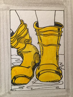
I couldn't wind down my salute to back-to-school shoes without a nod to Ben's favorite childhood footwear, the Puddle-Jumper Boot.  Now it seems like all of the big box stores carry a variety of colors and sizes of these practical shoe-savers, but in the 80's it was a different boot-buying terrain. 

Puddle Jumpers - Pencil, .8 black Micron pen and Faber-Castill Indian ink on Strathmore 300 series mixed-media paper.  Click on image to enlarge.
As I walked through Menards recently, on my way to the paint department, one of the end caps was filled with high-top puddle jumpers.  Some were solid colors, some were covered with flowers, and some were patterned with plaids and stripes.  I hope I can get back there in time to take a photograph before they are all sold!!! 
Puddle Jumpers - Pencil, .8 black Micron pen, FW Acrylic ink and Faber-Castill Indian ink on Strathmore 300 series mixed-media paper.  Click on image to enlarge.

Puddle Jumpers - Pencil, .8 black Micron pen, FW Acrylic ink and Faber-Castill Indian ink on Strathmore 300 series mixed-media paper.  Click on image to enlarge.

Thursday, October 22, 2015

Way Specialized........

The first time I went downhill snow skiing, the ski boots were very similar to a regular snow boot with added hardware on the bottom designed to attach the boot to the ski.

Lock and Load -  Pencil, and .8 black Micron pen on 300 series Strathmore mixed-media paper.  Click on image to enlarge. 

There was very little padding throughout, even though the ankle and back portion of the boot was extremely rigid.  Two pairs of heavy sock were good; three was better. 
Lock and Load - .8 black Micron pen, FW acrylic ink and Faber-Castill Indian ink on 300 series Strathmore mixed-media paper.  Click on image to enlarge. 


Lock and Load - .8 black Micron pen, FW acrylic ink and Faber-Castill Indian ink on 300 series Strathmore mixed-media paper.  Click on image to enlarge. 

Wednesday, October 21, 2015

Back to the Future Day!

Of course way before the specialization of the bike shoe, there was the "high top" tennis shoe.  The first ones that I remember were black canvas the exclusive domain of boys - that changed in a hurry, however!

Today's High-Top Tennies - Pencil, .8 black Micron pen, and Faber-Castille Indian ink on 300 series Strathmore mixed-media paper.  Click on image to enlarge
Right at the ankle bone there used to be a circle about 1.25 inches in diameter, and it carried the brand logo.  Of course the first wearers of black high top tennis shoes tucked the tongue in flat and straight, up the front and always laced them up snuggly with bow ties at the top in the front.  The laces were white. 
Today's High-Top Tennies - Pencil, 8 black Micron pen, FW acrylic ink and Faber-Castille Indian ink on 300 series Strathmore mixed-media paper.  Click on image to enlarge
This is one shoe that has been S.C.A.M.P.E.R.ed multiple times.  While the profile of the shoe is relatively unchanged, the color of the body and laces, texture of the sole, and material have been substitutes.  The tongue has been puffed and elongated, the lacing is left untied more than tied, and the tread on the bottom creates fabulous squeaks and squeals on any varnished wooden floor.  Add a little moisture, and the sound is the next best thing to a tire burn-out for the wearer!!   Did you notice, this is one of the few models of shoe where, most of the time, the logo has gotten smaller instead of larger! 
Today's High-Top Tennies - .8 black Micron pen, FW acrylic ink and Faber-Castille Indian ink on 300 series Strathmore mixed-media paper.  Click on image to enlarge. 
Be sure to check out the self-tieing Nike high-top shoes in Back to the Future, Part II.  They appear in the first 10 minutes or so of the movie and look tremendously similar to the green beauties above.  Differences include color (in the move they are metallic silver and white,) and the laces are more like ski boot bands, but theyself close.  There is a digital logo on the uppermost band - looks very much like a digital watch.  What fun to look at the futuristic ideas about the future in 1985 and compare to what is real today!!  

Tuesday, October 20, 2015

Bicycle Shoes

Biathlons and triathlons have helped prime the sports attire industry for specialization, like the "bicycle shoe."  Designed to align with the tread on the pedal and the strap that goes over the top of the shoe, these highly specialized shoes have changed a lot from the day of white canvas tie-shoes.  Of course, so has bicycling????

Bicycle Shoes - Pencil, .8 Micron pen, and Faber-Castille Indian ink on 300 series Strathmore mixed media paper.  Click on image to enlarge. 

Bicycle Shoes - .8 Micron pen, and Faber-Castille Indian ink on 300 series Strathmore mixed media paper.  Click on image to enlarge. 

Bicycle Shoes - .8 Micron pen, and Faber-Castille Indian ink on 300 series Strathmore mixed media paper.  Click on image to enlarge. 

Monday, October 19, 2015

Sensible Heels

Girls, do you remember the first time you wore heels?  Not just tried them on, but actually wore them out into the big, wide world? 
Sensible Heels- Black India ink and Faber-Castille Indian ink on 500 series Strathmore mixed media paper.  Click on image to enlarge. 

Sensible Heels- Black India ink and Faber-Castille Indian ink on 500 series Strathmore mixed media paper.  Click on image to enlarge. 

Sunday, October 18, 2015

The Next Best Thing.....

What is the next best thing to bare feet?  Sock, of course!  The words, "...it will be impossible to get those sock clean...." will forever reverberate in my mind.  I am not sure it ever occurred to my mother at the time that clean socks were an adult thing - I didn't care if my socks were a pristine white.  [It seemed to be important to the school - the "keep your shoes on" issue (see my entry on "Penny Loafers,")]  I don't remember my friends voicing big concerns about socks, either.   When bare feet were not practical or it was too cold, sock were clearly the next-best-thing.

Socks - Solo :  Black India ink and Faber-Castille Indian ink on 500 series Strathmore mixed media paper.  click on image to enlarge. 
 

Saturday, October 17, 2015

Boot Are In!

I just heard the big news on "Project Runway;"  "...boots are in this season."  I have lived in the midwest my entire life - when have boots NOT been in??
Suede Boots - Pencil, .8 black Micron pen,  and Faber-Castille Indian ink on 300 series Strathmore mixed media paper.  Click on image to enlarge.

Suede Boots - .8 black Micron pen, FW acrylic ink, and Faber-Castille Indian ink on 300 series Strathmore mixed media paper.  Click on image to enlarge.

Suede Boots - .8 black Micron pen, FW acrylic ink, and Faber-Castille Indian ink on 300 series Strathmore mixed media paper.  Click on image to enlarge. 

Friday, October 16, 2015

Flip Flops

It seems like some version of flip flops has been around for fifty or more years.  In my childhood they were rubberish with a plastic Y-shaped toe-divider and sold for 10 to 25 cents.  When I went to visit our oldest
son in college, they were the common foot attire on campus, but the plastic Y had been replaced with a heavyweight gross grain ribbon.  Relatively speaking, the cost was still low - around 2 dollars, plus tax.  

Flip Flips - .8 black Micron pen, pencil and Faber-Castill Indian ink on 300 series Strathmore mixed-media paper.  Click on image to enlarge.
As I was shopping for foot wear at the beginning of last summer, I was very surprised to see a moderately decorated flip flop with a very narrow Y band, still made of ribbon, selling for more that $45.00.  Wow, I missed the interim inflation stages.  I did a version that was very similar to the originals of "yesteryear," and still selling for under $5.00.  There were many bins of embellishments near the bins of flip flop in the local craft store, which added the potential for a substantial financial investment. 
Flip Flips - .8 black Micron pen, FW acrylic ink and Faber-Castill Indian ink on 300 series Strathmore mixed-media paper.  Click on image to enlarge.
Flip Flips - .8 black Micron pen, FW acrylic ink and Faber-Castill Indian ink on 300 series Strathmore mixed-media paper.  Click on image to enlarge. 

Thursday, October 15, 2015

Minnetonka Moccasins - Early High-Tops

Fashion fringe made an appearance in leather shoes, jackets and purses in the 60's,and periodically makes a come-back. Designers "borrowed" the idea, probably from early Native American examples of embellishment, and it was a hit. 

Tie moccasins - Pencil, black .5 Micron pen and Faber-Castill Indian ink brush pen on 300 series Strathmore mixed-media paper.  Click on image to enlarge. 
While these Minnetonka-brand moccasins initially appear to be a throwback to the original, this version actually has a synthetic, stitched on sole and arch supports on the inside. 
Tie moccasins - Pencil, black .5 Micron pen and Faber-Castill Indian ink brush pen on 300 series Strathmore mixed-media paper.  Click on image to enlarge.
With a little bear grease or silicone spray, depending on your waterproofer, these moccasins could get the wearer well into the winter as long as the snow doesn't get too deep! 
Tie moccasins - Pencil, black .5 Micron pen, Faber-Castill Indian ink brush pen, and FW acrylic ink on 300 series Strathmore mixed-media paper.  Click on image to enlarge

Wednesday, October 14, 2015

Slide 2

During the warm month of summer there is nothing more practical than the "slide," a toe-saving version of the flip-flop.

Slide 2 - Pencil, .8 black Micron pen and Faber-Castille Indian ink on 300 series Strathmore mixed media paper.  click on image to enlarge. 

Slide 2 - Pencil, .8 black Micron pen and Faber-Castille Indian ink on 300 series Strathmore mixed media paper.  click on image to enlarge. 

Slide 2 - Pencil, .8 black Micron pen, Faber-Castille Indian ink and FW acrylic ink on 300 series Strathmore mixed media paper.  click on image to enlarge. 

Tuesday, October 13, 2015

Cowboy 2

Cowboy boots have won the hearts of toddlers, teens, and adults for decades.  Although this boot is not a traditional cowboy boot, it has many features that have been "borrowed" from the classic style.

Cowboy 2 - Pencil, .8 black Micron pen, and Faber-Castill Indian ink on 300 series Strathmore mixed media paper.  Click on image to enlarge.
The toes are very structure and pointed and the piecing of the leather on the top of the toe area is very reminiscent of cowboy style.  As this young lady walked down the shopping center sidewalk, she did not have spurs on the back of her boots, but as she walked the chains that decorated the front of the boots did make a distinctive sound.  Because the chains rested right on the boot, there was not the "jingle" of the loose metal rotating as in the spur, but it was clearly an audible sound.

Cowboy 2 - Pencil, .8 black Micron pen,  Faber-Castill Indian ink and FW acrylic ink on 300 series Strathmore mixed media paper.  Click on image to enlarge.
There were two features that were noticeably missing from these fashion boots that assured all observers they were not cowboy boots, (in addition to the missing spurs.)  They did not have the decorative top stitching anywhere on the surface of the leather and no loops for pulling them on in the back.  The heels were somewhat lower and not a stacked wood, as well. 

Monday, October 12, 2015

Ride-'em Cowboy!

The foot wear that has remained virtually unchanged - well, at least visually unchanged, is the cowboy boot;  pointed toe, uniquely pieced hide (often leather or snake,) and loops for pulling on.

Ride-'em Cowboy - pencil, .8 black Micron pen, FW acrylic ink and Faber-Castill Indian ink brush tip markers on 300 series Strathmore mixed media paper.  Click on image to enlarge.
The first cool day of early October I saw a mom and two children headed into the grocery store.  She began herding them from behind and made me think of the classic cartoon image of a cowboy herding cats.  The boy, 6ish, had on long pants, tennis shoes, a sweater and jacket.  The girl, 4ish, had on a tank top, short-shorts, a long pink scarf that fluttered beautifully in the wind (not gale force, but both ends of the scarf were parallel to the pavement,) and wonderful light-blue, tall cowboy boots.

Ride-'em Cowboy - pencil, .8 black Micron pen, FW acrylic ink and Faber-Castill Indian ink brush tip markers on 300 series Strathmore mixed media paper.  Click on image to enlarge.
Between the wind and the scarf, it appeared as though the boots were driving the train.  They would lead the child to the left, closely followed by the mother with arms outstretched, and in a heartbeat the boots steered her at a ninety-degree angle, with the herder doing her best to anticipate.  Of course the older child was clearly the parking lot scout and on a marching mission in advance of the boots so.......the herder would jog three steps forward to corral the scout, then quickly redirect her attention to the furling scarf lead by the boots.  And so the procession continued all the way across the parking lot.  How do I know this - I just had to watch until the herder managed to bring-up-the-rear as her charges marched through the front door of the store.  I hope her adventure was somewhat more manageable minus the wind, on the inside.....not so sure about that, however....there's LOTS to distract wandering boots in a grocery store!!!!  Hats off to mothers!

Sunday, October 11, 2015

Celtic Princesses

A couple of times during the year, young ladies wearing Celtic dancing shoes have been featured on the news.  The most notable day, of course, is March 17th - St. Patrick's Day.

Celtic Princesses - pencil, .8 black Micron pen, and Faber-Castille Indian ink markers using brush tip on 300 series Strathmore mixed media paper.  Click on image to enlarge.
 An Irish bar in St. Paul is usually featured, and then there is a quick camera pan to the second floor, where Charles Schultz grew up.  It's as if the news writers are concerned that, on an annual basis, we will let Charlie Brown and crew fade into the sunset...oh wait....that's just what the major newspapers have done...hmmmmmm.   I was so glad to see that there is going to be a Charlie Brown movie  - soon to be released.
Celtic Princesses - pencil, .8 black Micron pen, Faber-Castille Indian ink markers using brush tip, and FW acrylic ink on 300 series Strathmore mixed media paper.  Click on image to enlarge.
I hope the new writers have captured the humor and look at innocence for the child's viewpoint.  The cartoon characters and the music from earlier TV specials are easy to maintain in 2015, but the Schultz point-of-view will take intention on the part of the new writers!  Perhaps Peppermint Patty will be the Celtic dancer in the new movie in tribute to the St. Paul connection.  We'll all have to watch to see!!
Celtic Princesses - pencil, .8 black Micron pen, Faber-Castille Indian ink markers using brush tip, and FW acrylic ink on 300 series Strathmore mixed media paper.  Click on image to enlarge.