It seems so simple, and so impossible, that the accumulation of these six-sided gems can wreak such chaos and havoc in major cities and throughout the country side by simply sticking together. Another one of Mother Nature's examples of ways to be powerful and successful....what was that famous Kindergarten rules to live by......to paraphrase: '....and remember, when you are crossing the street, remember to hold hands and stick together.....' Look what it has done for the tiny snowflake!
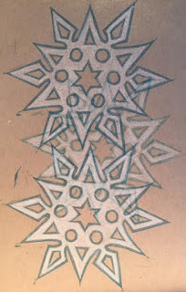 |
| Layered relief prints - Snowflakes 'sticking together' - Ranger blue ink on tan 300 series Strathmore paper. White added to flake prints with FW acrylic ink. |
Actually, the paraphrased pseudo-quote is from Robert Fulghum and includes 15 additional pieces of Kindergarten wisdom to live by. See below for the actual list.
“These are the things I learned (in Kindergarten):
1. Share everything.
2. Play fair.
3. Don't hit people.
4. Put things back where you found them.
5. CLEAN UP YOUR OWN MESS.
6. Don't take things that aren't yours.
7. Say you're SORRY when you HURT somebody.
8. Wash your hands before you eat.
9. Flush.
10. Warm cookies and cold milk are good for you.
11.
Live a balanced life - learn some and drink some and draw some and
paint some and sing and dance and play and work everyday some.
12. Take a nap every afternoon.
13. When you go out into the world, watch out for traffic, hold hands, and stick together.
14.
Be aware of wonder. Remember the little seed in the Stryrofoam cup: The
roots go down and the plant goes up and nobody really knows how or why,
but we are all like that.
15. Goldfish and hamster and white mice and even the little seed in the Styrofoam cup - they all die. So do we.
16. And then remember the Dick-and-Jane books and the first workd you learned - the biggest word of all - LOOK.”
―
Robert Fulghum,
All I Really Need to Know I Learned in Kindergarten
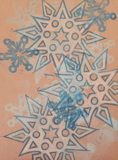 |
| Layered relief prints - Snowflakes 'sticking together' - Ranger blue ink
on tan 300 series Strathmore paper. White added to flake prints with
FW acrylic ink. |


