Foraging for a Meal

Foraging for a Meal
Foraging for a Meal at 30 below!

Wednesday, August 12, 2015

Zorn's Water

I really wanted to see what some of the masters have done to represent water in their painting on display at the Minneapolis Institute of Arts, so I took a field trip downtown.

The Girl from Alvdalen, c. 1911, Anders Zorn; oil on canvas.  Painting on display at the Minneapolis Institute of Arts.
The first painting of water to catch my interest was the painting above, by Anders Zorn.  He was a Swedish painter who lived from 1860 to 1920.  At the turn of the century, folks like Henry Ford were streamlining processes and moving the world, full steam ahead, in industrialism.  At this same time, Sweden was rekindling a passion for nationalism, and working hard to preserve and represent their cultural heritage.  Zorm '...often featured local females at their work in the field or in the home."

Although I appreciate the authenticy of the native costuming, it is the water that I spent a lot of time studying.  The way Zorn has captured the shadows, , movement and transparency of the water is facinating.

Note in the closer details below, how he has allowed the ripples in the water to distort the shape of the feet submerged in the water.
Anders Zorn, The Girl from Alvdalen, c. 1911, oil on canvas.  Click on image to enlarge. 
When I was able to get very close to the painting (OK, not REALLY close, afterall, it is a museum, with uniformed security, etc.) the white brush strokes where the brightest light is reflected, makes the painting look much more 2 dimensional.  It was very encouraging to see this wonderful painting both up close and from across the gallery, to fully appreciate the impact of distance and perspective on the image.

The last time I was at the MIA, there was a painting by a Norwegian painter that showed water in a canal.  I went looking for that one next. 

Tuesday, August 11, 2015

Intriguing???? and....What About Those Bubbles?

So, there is nothing particularly endearing about a seahorse.  You can't really have one as a pet, they are not cute and cuddly, and you cannot take one with you on a road trip or to the park.  Their intriguing feature, that keeps us interested, seems to rest in fact that the males incubate the young and give birth.  That holds such fascination that it keeps us coming back to check them out.

What if, instead of being shaped like a horse on the top, they were shaped like a pig, or an anteater and launched forth little piggies or mini-anteater-like swimmers?  Would they be as intriguing?  Good question!  They even have a great brow ridge to give their face a discerning look.  Are they deep thinkers????  What if we discover another aesthetically appealing critter in the wild that passes traditionally maternal responsibilities to the males of the species;  will we be equally as intrigued?  So, is it about the aesthetics of cutness first, THEN biology, or....the other way around?

Why are we so intrigued by seahorse?  A resident in the "maternity ward" tank.  Photograph.  Click on image to enlarge.  Sorry it is not very clear.
Adding details to "de tail' (OMG, sorry, I just had to do that,) is the key to the depth and contrast of this painting.

The highlights, shadows, segments, cilia and overlapping all work to make this seahorse more dimensional.  I think the bubbles give the entire painting more depth, as well.  Acrylic on canvas.  Click on image to enlarge.
I usually like to identify the location of the bubble-source if I am including bubbles in a drawing or painting.  In the first otter painting, for example, it was clear that the air was carried in the dense coat of the otter and small bubbles were released as the hairs of the coat separated as the otter was swimming through the water.  In fact, in the first otter painting (see earlier posts,) the bubbles also served to indicate the direction of travel and, to some extent, the depth of the water.

Because the resource for this painting is a picture from an aquarium, the bubbles are not really produced by the seahorses, plants, other fish, etc. or any other living things, but by the pumps and filters  attached for the purpose of cleaning the water.  With these somewhat barren-appearing tanks, the filtration systems are very visible and obvious; making an "artistic license" decision to omit that portion of the source images and just keep the bubbles was an early decision. 

A good question to ask might be:  "When you see bubbles included in a visual image, do you look for their source?" 

Monday, August 10, 2015

Adding Details to the Seahorse

The seahorse is taking on somewhat of an animated look.  Although I have seen a delightful bright green seahorse at the Tampa aquarium, I haven't really seen a purple one, even in artificial lighting.

This image is a combination of several different elements seen at the Mote Aquarium.  The Sargasso-like qualities of the broad plants are not from any of the exhibits, however.  Acrylic on canvas.  Click on image to enlarge.
The seahorses in all of the exhibit have a segmented appearance.  On closer inspection, they have little cilia on each segment, that move with the motion of the water.  It is difficult to tell if the water is moving these parts of the seahorses, or if the seahorses are using the cilia as a means of self-propulsion.  The dorsal fin is almost invisible, but does appear to influence both motion and direction.


Portion of seahorse with highlights, shadows, and cilia added.  Acrylic on canvas.  Click on image to enlarge.
The details on the tail, and the way it wraps around the sea grass, is still the make-it-or-break-it portion of this painting. 

Sunday, August 9, 2015

Disneyesque????

From my earlier sketches (in actual time, these events were a couple of months apart,) I remembered that the overlap of the tail of the seahorse around the plant blades was important as was the contour of the actual tail.

This was my reminder image about what aspects were important at the time of sketching. Now I have to decide if they are STILL important AND if so, how to create the effect I want in the painting.

I decided that both of these painting characteristics were still important, to began adding the seahorse to the water and sea grasses. I also decided that I did NOT want to make him brown and beige - purple would work well with water and grass colors AND with the previous aquatic set of paintings - hello Disneyesque seahorse......could this be a potential Little Mermaid critter...hmmmm??

The light/dark colors of the tail help create the dimension I am looking for and the overlapping is essential to tell the story of "..the seahorse and the plants...."  Acrylic on canvas.  Click on image to enlarge.
What is that you are thinking??? - "The Seahorse and the Plants," does not have the same resonating appeal as a title like "The Little Mermaid?"  I kind of like it!

Saturday, August 8, 2015

Seahorse Habitat

In Grand Marais, I decided to paint the seahorse clinging to the aquatic plant.  As with my 2014 painting GM Painting collection, I decided to experiment with color to create more interest, dimension, and contrast. 

This color blue is consistent with the aquatic series from 2014.  This is the color toward the surface, where the sunlight is able to filter through the water; deeper is darker.  Acrylic on canvas. 
This vertical slice provides insights into the changing tone of the water as you descend toward the bottom of the picture.  I also decided to make the plants more teal than limey-green.  Notice that as the plants mover further back in the visual plain, they are darker and less defined.  Acrylic on canvas.  Click to enlarge image.
I thought about creating an ocean floor in this painting similar to the one in the "blue fish" painting.  Since one of the challenges in "blue fish" is the competition of visual attention (between the fish and the boulders,) I decided to make this painting about vertical images.  (It does help that this is also a vertical canvas that is 12" X 24".)

The overlapping plants in the bottom left-hand corner of the painting, are intended to create depth in the water and distance in the landscape.  I lover the curvature of the plant blades in the foreground, but still think this is a very two-dimensional space.  I am resisting the urge to add boulders for landscape (OK, seascape, distance.)

Friday, August 7, 2015

More Males Should Try This......

The Mote Aquarium, in Sarasota, opened a new exhibit in the spring, that focused on aquatic babies.  Several of the tanks, both in this exhibit and in the lab off of the gift shop, were teaming with seahorses.  One tank, in particular, contained very "pregnant" fathers only.  I would be a very interesting notion if there were more males in the world who had the opportunity to carry and deliver offspring........

Not the greatest detail, but a good reference for shape, surface pattern, and fins.  Photograph.
I was surprised how aggressive the males were towards one another and wondered if they get as anxious as  delivery approaches as many human mothers do.  As with the nautilus, I am amazed at how mobile these sea creatures are and how speedy.  I did some quick sketches for use at a later time (in case I wanted to do a painting.)

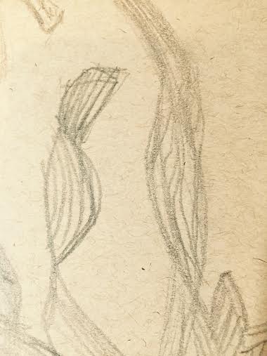
This was another seahorse in the tank that had attached itself to some plants, by using it's tail - an interesting image, particularly in the overlapping and contrast of the colors.  Pencil on tan Strathmore sketch, 400 series.  Click to enlarge.
The bright green plants present a nice contrast in color to the background blue of the tank as the spiral upward.
If I do a painting of the seahorse, I will need to think about colors.  Most of the aquarium habitats I have observed in Florida emphasize a cerulean or pthalo-blue/aqua environment, yet the real seahorses in this exhibit or beiges and browns.  A great contrast would be orange or purple....hmmmmm!!!

These plants are a brilliant yellowy-green and appear to be semi-transparent.
I think in a painting, the plants will also have to be a broader range of green than in the actual exhibit.....otherwise a painted image will look very two-dimensional.

I love the motion in this overlap.  In addition to line, shading and contrast will be important in a painting.  The contour lines of the tail help with dimension!  Click to enlarge.
The little seahorses are fascinating to watch. Their tails help them navigate, swim, and secure themselves to objects...and who knows what else....

I placed these images in my "....save for Grand Marais" folder just in case I wanted to paint it as a follow-up to last year's aquatic set (in the summer of 2014 I also attended a 2-day workshop with Liz and completed four nautical painting:  an octopus, a lion fish, a crab, and a jellyfish!) 

Thursday, August 6, 2015

Comparitive Analysis

Although not the native colors of the nautilus, I want to explore the same colors that I used in the "Blue Fish" painting.  This will be a good opportunity to continue my work with ....'knowing when to stop...."  This was a great grand Marais discussion, right Crystal?

Quick sketch of one of the Grand Marais nautilus residents.  Pencil on tan Strathmore sketch paper, with white china marker used to emphasize highlights.
Portion of nautilus, swimming, painting.  Acrylic on Gessobord.  Click on image to enlarge.
I concentrated on keeping the movements fluid and not overworking this image.  Although the effect is not ethereal (and never has been,) the image keeps the clean look I was looking for in both this painting and the earlier blue fish painting.  I achieved an image closer to my goal in technique and energy, in the nautilus.