Foraging for a Meal

Foraging for a Meal
Foraging for a Meal at 30 below!

Friday, August 7, 2015

More Males Should Try This......

The Mote Aquarium, in Sarasota, opened a new exhibit in the spring, that focused on aquatic babies.  Several of the tanks, both in this exhibit and in the lab off of the gift shop, were teaming with seahorses.  One tank, in particular, contained very "pregnant" fathers only.  I would be a very interesting notion if there were more males in the world who had the opportunity to carry and deliver offspring........

Not the greatest detail, but a good reference for shape, surface pattern, and fins.  Photograph.
I was surprised how aggressive the males were towards one another and wondered if they get as anxious as  delivery approaches as many human mothers do.  As with the nautilus, I am amazed at how mobile these sea creatures are and how speedy.  I did some quick sketches for use at a later time (in case I wanted to do a painting.)

This was another seahorse in the tank that had attached itself to some plants, by using it's tail - an interesting image, particularly in the overlapping and contrast of the colors.  Pencil on tan Strathmore sketch, 400 series.  Click to enlarge.
The bright green plants present a nice contrast in color to the background blue of the tank as the spiral upward.
If I do a painting of the seahorse, I will need to think about colors.  Most of the aquarium habitats I have observed in Florida emphasize a cerulean or pthalo-blue/aqua environment, yet the real seahorses in this exhibit or beiges and browns.  A great contrast would be orange or purple....hmmmmm!!!

These plants are a brilliant yellowy-green and appear to be semi-transparent.
I think in a painting, the plants will also have to be a broader range of green than in the actual exhibit.....otherwise a painted image will look very two-dimensional.

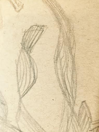
I love the motion in this overlap.  In addition to line, shading and contrast will be important in a painting.  The contour lines of the tail help with dimension!  Click to enlarge.
The little seahorses are fascinating to watch. Their tails help them navigate, swim, and secure themselves to objects...and who knows what else....

I placed these images in my "....save for Grand Marais" folder just in case I wanted to paint it as a follow-up to last year's aquatic set (in the summer of 2014 I also attended a 2-day workshop with Liz and completed four nautical painting:  an octopus, a lion fish, a crab, and a jellyfish!) 

Thursday, August 6, 2015

Comparitive Analysis

Although not the native colors of the nautilus, I want to explore the same colors that I used in the "Blue Fish" painting.  This will be a good opportunity to continue my work with ....'knowing when to stop...."  This was a great grand Marais discussion, right Crystal?

Quick sketch of one of the Grand Marais nautilus residents.  Pencil on tan Strathmore sketch paper, with white china marker used to emphasize highlights.
Portion of nautilus, swimming, painting.  Acrylic on Gessobord.  Click on image to enlarge.
I concentrated on keeping the movements fluid and not overworking this image.  Although the effect is not ethereal (and never has been,) the image keeps the clean look I was looking for in both this painting and the earlier blue fish painting.  I achieved an image closer to my goal in technique and energy, in the nautilus. 

Wednesday, August 5, 2015

Northern Visitor

The colors of "Blue Fish" have been fun to experiment with and are worth trying with another image.  While at the aquarium, I also did a few quick sketch of the nautilus and would like to try using blues and purples to create the depth and contour of this elusive critter.

What a curious creature resides in the beautiful, swirling shell.  Pencil on tan Strathmore sketch paper.  Click to enlarge.

The protective mantel over the eye and shell opening is difficult to define on the aquarium guests.  It is perched above the eye, but pulled into the recesses of the shell opening to protect the body mass.

It's amazing how fast these creatures can move.  It's the use of the air in the layered chambers on the internal portion of the shell that help create the buoyancy, which helps with mobility.....who would know by looking, ah?
Although the nautilus is not a fresh-water dweller, one of the salt water exhibits in Duluth contained two resident northern visitors.  Challenging lighting to capture a lot of details....mystical aura, however!


Tuesday, August 4, 2015

Ooopps, TOO Far!!!

Based on the Notan, I decided to spend more time working with the fish and some of the rocks (particularly the bright green ones.)

Layers #2, #3, and #4  of the "Blue Fish" after analysis of the Notan.  Acrylic on Gessobord.  Click to enlarge. 
This is the perfect example, to me, of one step too far.  The ethereal quality of the first layer of Blue Fish is almost completely gone.  I think the bright lights and the yellow highlighted  areas help the light rays from the surface accomplish create dimension in the fish.  If I decide to make a larger version of this painting, on canvas, masonite, or Gessobord, I will stop earlier to maintain that ethereal quality that was the best part of the first fish! 

Monday, August 3, 2015

A Delicate Dance with Light

The placement process for the fish in the depths of the bottom environment were similar to the placement of the moose in the gently flowing stream.  Too close to the rocky bottom and the delicate fins and tail appeared to be in jeopardy.  Too close to the surface and the pale characteristics of the fish didn't fit the surface environment.  I started by quickly laying in two basic colors in a semi-transparent wash.

Fish layer #1 on top of the ocean-bottom rocks and water.  Acrylic on Gessobord. 
I really like the ethereal quality of the fish above and am very tempted to stop right now.  I have used the edit capacity of the iPad to look at the gray range, taking the color out of the decision making.

Fish, using iPad tools to create a "Notan-esque" image for analysis.
Early this Spring, I was re-introduced to the concept of Notan as part of the process to be planful about design and composition.  Literature about "notan" credits the Japanese culture for its' development:

 "Notan is a unique type of study that allows us to explore the essential energies of a composition through an arrangement of darks and light patterns.  Notan is a Japanese word that means "light-dark harmony."  This strict dark-light arrangement has a unique way of revealing the underlying structure of a composition, thereby allowing us to take an active role in the manipulation of the compositional energies."  www.mitchelaballa.com in Exploring Composition Through Shape and Notan


This is indeed a tough decision for me.  The Notan representation has areas that are too indecisive for me, however, so I will decide quickly. 

Sunday, August 2, 2015

Bottoms Up

I decided to start the painting with the ruggedness of the bottom.  I would like to create some distance in these rocks,and want to sue the techniques that include:

     1.  Making the rocks ih the distance smaller than those in the foreground
     2.  Making the rocks in the distance darker than in the foreground
     3.  Making the rocks in the distance less detailed than those in the foreground

Rocks - Layer #1.  rough edges begin to define the bottom rocks.  Additional refinement needed.  Acrylic on Gessobord.

The additional shading and highlighting on the rocks helps create contour and depth.  The highlighting on the darker, smaller boulders in the back help create distance, as well.  Click on image to enlarge. 
 I addition to the refinement on the rocks, I have continued to work on the rays of light coming from the surface.  I would like the boldest sun rays to align with the brightest surfaces of the rock faces, including those in the farthest distance. 

Saturday, August 1, 2015

Underwater Blues

Time to explore another color palette -

While exploring at the Duluth Aquarium, I discovered some very pale fish.  They seem to be either bottom-dwellers or murky-water dwellers, and take on a very albino-like patina.  If they had red eyes or fin and gill coloration, I would assume they were albino.  Because of the lighting in the exhibits, many of these very pale fish take on more trendy, fluorescent colors when they are in the right location in their own confined quarters.  The development of this blue environment and fish is the result of pushing the subtle effects of the lighting further beyond it's limitations.  I began with a sketch of the most appealing, pale fish in the collection;  I do not know the species of the fish, but it is native to fresh water in Minnesota AND is NOT a koi. 

6B graphite pencil on tan Strathmore sketch paper with white china marker highlights. 
Don't the features, body-shape and fins make you think goldfish?  It's actually about an 8 pound fish, however. 
Because this fish appears to be a bottom-dweller, creating a substantial bottom environment will make a more meaningful visual environment. 

Quick sketch of boulders on the bottom landscape with reminder lines for sunlight rays creating rock/boulder highlights.  6B graphite pencil on tan Strathmore sketch paper.