Foraging for a Meal

Foraging for a Meal
Foraging for a Meal at 30 below!

Saturday, February 20, 2016

Trial #2 on Opaque White

This example uses the same shapes and sizes of heavy copper foil, the same clear glass cap, but a different anchor piece.
Three layer trial - white, opaque, non-reactive COE 90, heavy copper foil, and narrow clear cap before entering kiln.
The white glass on the bottom of the triple layer is solid an opaque, but not labelled "reactive.  I did not expect it or the copper to show signs of chemically being effected by the other.

Three layer trial - white, opaque, non-reactive COE 90, heavy copper foil, and narrow clear cap after firing in kiln.
It was interesting to me that the copper in this "sandwich," has more variation in the coloring under the clear glass.  In the enlargement of the area around the star, seen below, the variations in the copper are more easily seen. 

Close up of three layer trial, specifically designed to study variations in copper coloration after firing.


It would be interesting to try several variation of base color, heavy copper foil and narrow clear cappers to see if the variations are a result of the base glass or can they be attributed to something else.
 
I have learned that, at its very best, working with glass is a series of trial, error, and LUCK.


Friday, February 19, 2016

Chemical Reactions in Fused Glass

I had the opportunity to participate in a class at Delphi Glass in East Lansing, Michigan last summer.  My  interest in understanding the chemical reactions resulting in the interaction of some glass and some metals has increased as I work more with fused glass.

Roy, the teacher, was very knowledgeable and shared a lot of information in a relatively short class.  Over the next few days I will share some of the interesting things I learned and provide an example or two.

Below is a three-layer stack ready to fuse.  On the bottom is blue streaker glass, which is somewhat opaque and NOT solid blue, but marbled with a lighter tone of blue.  On top of that is a piece of heavy copper foil, and topped with a narrow piece of clear 90 COE glass.  Notice that neither piece of copper is completely covered by clear glass.
Copper foil on blue glass with partial clear cap before entering the kiln.

Below is the same piece of three-layer glass/copper/glass after it has been fired.  Notice that the copper covered by clear glass has oxidized to a burgundy-red, but the exposed edges, not covered by the clear glass, look much more charred and have little burgundy-red color.  Also notice that the marbling in the blue glass is more pronounced.  I do not believe the characteristics in the blue glass are related to a reaction to the copper.  The rounding of the corners of the glass is a characteristic property of fluids when the are able to move - for glass this means heating.  The property creating the rounded corners is "surface tension."  All fluids will try to occupy the least space possible - think of a soap bubble.  Surface tensions pulls the surface molecules together as much as possible for the environment they are in.  In the case of a soap bubble, they create a sphere.  In the glass below, contact with the firing paper and gravity interfere with the formation of a sphere.......gravity wins!
Copper foil on blue glass with partial clear cap after leaving the kiln.

Thursday, February 18, 2016

Natures True Beauties

Putting together several variations of accurate snowflakes can create an ascetically interesting image.  Since my white ink has not maintained it's "whiteness," even the pseudo white flakes have a strong blue cast. 

Up close on a snowy day!
Unlike Mother Nature's accumulations, these don't have to be shoveled or relocated!
More snowy day visions.
 
They also don't add a chill to the air - although they may have the power to send a chill up your spine.


Wednesday, February 17, 2016

Are they ALL reallly different - beliefs have changed over time!

The news is so filled with the snow accumulations across the northern US, that I was inspired to carve some flake variations. 

Layered relief prints - Snowflakes 'sticking together' - Ranger blue ink on tan 300 series Strathmore paper. 
The flake above is actually pretty small - only 2" X 2".  The flake below is double in diameter! 

Mutant Snowflake relief print - Ranger lavender-blue ink on tan 300 series Strathmore paper. 
I think Miss Baker would love this type of visual snowflake study!  Since my elementary school days, many books have been published to capture beautiful snowflake variations in great detail.  The adult coloring book craze that is so popular now also includes entire workbook-size line drawings of single, layered and patterned multiples of snowflakes for your coloring pleasure.

Mutant Snowflake relief print - Ranger lavender-blue ink on tan 300 series Strathmore paper. 
As is often the case with snowflakes 'in the wild,' this flake is a mutant.  Use your visual analysis skills to see if you can spot the mutation! 

Tuesday, February 16, 2016

Power in Numbers!

 It seems so simple, and so impossible, that the accumulation of these six-sided gems can wreak such chaos and havoc in major cities and throughout the country side by simply sticking together.  Another one of Mother Nature's examples of ways to be powerful and successful....what was that famous Kindergarten  rules to live by......to paraphrase:  '....and remember, when you are crossing the street, remember to hold hands and stick together.....'  Look what it has done for the tiny snowflake!
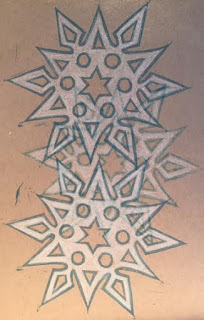
Layered relief prints - Snowflakes 'sticking together' - Ranger blue ink on tan 300 series Strathmore paper.  White added to flake prints with FW acrylic ink.
Actually, the paraphrased pseudo-quote is from Robert Fulghum and includes 15 additional  pieces of Kindergarten wisdom to live by.  See below for the actual list.

“These are the things I learned (in Kindergarten):

1. Share everything.
2. Play fair.
3. Don't hit people.
4. Put things back where you found them.
5. CLEAN UP YOUR OWN MESS.
6. Don't take things that aren't yours.
7. Say you're SORRY when you HURT somebody.
8. Wash your hands before you eat.
9. Flush.
10. Warm cookies and cold milk are good for you.
11. Live a balanced life - learn some and drink some and draw some and paint some and sing and dance and play and work everyday some.
12. Take a nap every afternoon.
13. When you go out into the world, watch out for traffic, hold hands, and stick together.
14. Be aware of wonder. Remember the little seed in the Stryrofoam cup: The roots go down and the plant goes up and nobody really knows how or why, but we are all like that.
15. Goldfish and hamster and white mice and even the little seed in the Styrofoam cup - they all die. So do we.
16. And then remember the Dick-and-Jane books and the first workd you learned - the biggest word of all - LOOK.”
Robert Fulghum, All I Really Need to Know I Learned in Kindergarten
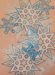
 
Layered relief prints - Snowflakes 'sticking together' - Ranger blue ink on tan 300 series Strathmore paper.  White added to flake prints with FW acrylic ink.

Monday, February 15, 2016

Essential FLAKE Attributes


Ms. Baker, the wonderful  science teacher we had the opportunity to work with in elementary school, was a stickler for accurate snowflakes.   She spent a lot of time teaching us about the formation of snowflakes at various layers of the atmosphere and the importance of recognizing the six sides on every flake.  We spent time with black chunks of velvet cloth catching snowflakes and looking at them under a microscope she carried outdoors.  We also spent time coloring, cutting and drawing accurate representations of snowflakes.

To this day, if I see an inaccurate representation of a snowflake, I think of Ms. Baker and how disappointed she would be in that image-maker.

Snowflake tracing - image traced from six-sided, hand-cut paper snowflake. 
It is amazing how many business establishments AND schools allow inaccurate flakes to hang throughout their properties.  It's as if they do not realize that four-sided and eight-sided flakes do not abide by the rules of Mother Nature. 

Snowflake #1 - Hand carved relief block based on sketch #1 of six-sided snowflake.
Inaccurate and incorrectly formed flakes may serve as a reminder that, as adults, it is our responsibility to use anatomically correct representations of snowflakes to decorate for the season.  This lesson is part of the bigger message that in nature there are rules that are followed.  Without the rules of nature, chaos may follow. 

Snowflake #1 - Notice that this block has been inked and is ready to print proof #1.
We have seen this play out in massive oil tanker spills, Chernoble, and the Tokyo reactor break-down.  What is driving the El Nino/La Nina weather, the drought in California, and the low saline levels and high levels of crop-based chemicals pouring into the Gulf of Mexico from Lake Ochochobee??????

Is it possible to be better steward of our environment by starting with something as simple as accurate "flake" representation?  Good question!!!

Sunday, February 14, 2016

Valentine's Day!!!!

Here's to you on this special day that provides an opportunity for us to show affection and appreciation for those we care about! 

Lemonade Mix relief print - Black Daniel Smith water soluble relief ink and FW acrylic inks on 400 series Strathmore printmaking paper.

This block provides the perfect example of a way  to use one relief block for different purposes simply by changing the color palette.  The lemonade mix above would be an interesting mix for the taste palette, makes an interesting mix visually. 
Lemonade Mix relief print with tablecloth- Black Daniel Smith water soluble relief ink and FW acrylic inks on 400 series Strathmore printmaking paper.
It is also an example of how the viewer works to make sense of an image immediately.  It would be interesting to ask several viewers whether they thought about the visual image in terms of color and visual appeal OR the combination of tastes of the food presented????  The image below is immediately recognizable to most viewers, so the first view is not needed to make sense of the image.
 The Real Deal - Bloody Mary -  relief print - Black Daniel Smith water soluble relief ink and FW acrylic inks on 400 series Strathmore printmaking paper.

 So what does the viewer jump to once the Bloody Mary is quickly recognized - what did you do next - think about the attached foods, think about the visual accuracy, think about where you last enjoyed drinking a bloody mary, think about the movie "South Pacific??"  The thoughts patterns are endless!  So, is that one of the values of producing and sharing the visual image????  Makes you think!!

 Happy Valentine's Day!