Foraging for a Meal

Foraging for a Meal
Foraging for a Meal at 30 below!

Wednesday, August 19, 2015

More Daisy Sketches

Today I had a little more time to work with the details of each sketch.  I am still working with just pen and ink, so each is still a line drawing.  The first one includes some negative space work, but was completed very quickly.

Micron pen on 300 series Strathmore mixed media paper, white.


The imperfection of this daisy was very interesting to me, so I took more time to sketch in some of the details. The spaces between the petals are as important as the veins in each of the petals, to give the entire sketch balance and visual interest.   Although a different application of negative space, one that can be equally valuable in the right situation.

Micron pen on 500 series Strathmore mixed media paper, white.  Click on image to enlarge.


Tuesday, August 18, 2015

Practicing Definition with Negative Space

Using this simple image, this is a good time work with defining the flower in negative space. 

Micron pen on 500 series Strathmore mixed media paper.  Click on image to enlarge. 
The shapes of the petals in the sketch above are defined by the crosshatching around them.  I enjoy creating these types of images and will need to be deliberate if I am going to incorporate this type of negative space into a full scale work. 

Below is a close up sketch, and not only uses negative space but the idea of a window frame restricting a portion of the view.  The entire sketch is just two petals; this is not a cropped sketch.

Micron pen on 500 series Strathmore mixed media paper, white.  Click on image to enlarge. 

Monday, August 17, 2015

The Daisies Have Arrived!

What fun it has been to watch the arrival of the garden daisies and the bird and insect population that has followed their arrival.  For quick studies, I have decided to try a variety of daisy sketches. 

Micron pen on Strathmore 500 series mixed media paper, white.

Micron pen on Strathmore 500 series mixed media paper, white. Click on image to enlarge.
 I like the density of this image.  It better represents the actual garden, particularly the section with the tallest flowers.  These images are so general, however, that they could represent almost any emerging blossoms.  The sketch below is much more specific to Shasta daisies. 

Micron pen on Strathmore 500 series mixed media paper, white.  Color added with FW acrylic ink, brushed.  Click on image to enlarge.

Sunday, August 16, 2015

Artist's Decisions (with a question at the end)

Reading through some information about Tissot again reminded me of the choices artists must make time and time again.  In addition to composition, color, "when is it really done..," etc, there is the ongoing question of actual content and technique.  History spends volumes of time and text informing us about the "game changers" throughout time; those people who were anarchists, or joined forces with other "out of the box" thinkers, within their own culture, to shift the status quo.  Tissot is the perfect example of a very competent and financially successful artist who is not well referenced in historical documents for his style, subject matter, technique, color choices, etc.

During the nineteenth century, notable artists in France knew one another and gathered together to discuss "art stuff,"  renderings, techniques, genre, etc.  The evolution of one of these groups, which came to be known as the Impressionists, is well known.  Tissot not only lived during the rise of this group, but was friends with the artists that we know today as Impressionists.  In fact, Degas painted a portrait of him early in the Impressionistic movement.  In 1874 (after Tissot's moved to England,) Degas asked Tissot to "join them in the first exhibition organized by the artists who became known as the Impressionists, but Tissot refused." Wikipedia   He did maintain his friendships with the artists in the group, however, all of his life.

So what was it that helped Tissot hold his ground in his artistic style when many of those who were his friends were focused on light, pointalism and heavy oil washes?  For one thing, he was very financially successful.  As he moved more and more towards realism, his work became very popular with wealthy patrons.  Here is the artistic dilemma:  did he paint to the wishes of the patrons, his personal philosophies, his historical grounding in textiles and fashion, anarchy to the Impressionistic movement, or.....some other driving force?  Every artist who is selling work must make the decision of what to paint and how to do it with every canvas.  The painting style seen in On the Thames, A Heron and like those seen below, made him a very wealthy man.  Yet in a era where the tides of history celebrate the rebels, the artisan is not deemed significant for his artistic techniques or style.

Young Lady in a Boat, 1870 by James Tissot, oil on canvas.  Click on image to enlarge. Wikipedia
Young Lady in a Boat, completed two years prior to "...Heron..." in the MN Institute of Arts, has many similarities to the MN painting.  The textiles in this painting are very typical of much of his work and was highly sough after by wealthy industrialist patrons.  Notice the differences in the water in this painting and the one two years later, however.  It would suggest that the Impressionists did have some influence on the later piece.  Also, the location of the second image in this painting, the dog, and the second image in the MIA painting, the heron indicate a Japanese influence.  Clearly, Tissot is very success at blending influences from multiple sources and making them his own.  These constant adaptations would suggest that he was painting to please others (and his bank account,) as much or more than to declare a personal philosophy - ongoing decision for all artists who sell their work.

Bad News 1872, by James Tissot, oil on canvas.  Click on image to enlarge.  Wikipedia
Bad News was completed the year Tissot left France and moved to England.  Initially, the belief was that he left during the Franco-Prussian war as a political statement of conviction.  Addition research suggests, however, that he left to protect his paintings and materials.  It is clear what historian value as they convey events, but for the artist (or anyone for that matter,) is self preservation a less noble reason to relocate than political declaration?  Clearly, historians favor the anarchist over the pragmatist. 

In his later life, Tissot's work shifted to Bible themes, and appeared to be a reconnection with the teaching of his youth, primarily by his mother.  It is interesting to note that although he is not touted as a founding father, or even a participating member of the Impressionists, his work has provided a strong foundation for films like Raiders of the Lost Ark and The Age of Innocence.   His subject matter and imagery is valued over his technique.  The painting below is more typical of his later years.

The Ark Passes Over the Jordan, 1896 - 1902.  James Tissot. Click on image to enlarge.  Wikipedia
So, if you are an artist who always, sometimes, or occasionally sells your work, what influences your image choices and to what degree? 

Saturday, August 15, 2015

Tissot's Water

The fourth painting at the Minneapolis Institute of Arts that features a lot of water is "On the Thames, A Heron," by James Tissot.  Tissot  was a french painter who lived from 1836-1902.  During the Franco-Prussian war he became a political refugee, fleeing to England from France.  While the French preferred sentimental narratives, the English market wanted images depicting Victorian charm.  This painting, completed between 1871 and 1872, shortly after his arrival in England, is one of his first English works.  Influences reflecting the demands of both markets are apparent.

On the Thames, A Heron, c. 1871-1872, James Tissot, French, 1836 - 1902; oil on canvas. Click on image to enlarge.  Minneapolis Institute of Arts collection.
In addition to mixing the market demands of both French and English clients, he has also incorporated the "aesthetics of Japanese design in his use of a high vantage point and the juxtaposition of two separate pictorial elements in compressed space."  MIA informational display plate.

Of course in this visit to the Institute,  what caught my eye for further investigation, was the water and reflected light.  Did you see the heron right away?  If the clue "heron" wasn't in the title of the painting, I certainly would not have approached the canvas looking for a bird.

Again, from a distance, the water appears very photographic.  It does not show the impressionistic techniques displayed in the work of the three previous painters who worked only ten to twenty years later.
Notice in the image below, on closer inspection, that the realism of the water breaks down in much the same way the work of Zorn does on close inspection.

On the Thames, A Heron - cropped, by James Tissot, c. 1871-1872.  Oil on canvas.  Click on image to enlarge.  Minneapolis Institute of Arts collection.
I thought it was interesting that the body of the lace shawl, the gloves, and the boards making up the sides of the boat do not deconstruct in the same way as the water in front of the boat.

On the Thames, A Heron - cropped, by James Tissot, c 1871 - 1872.  Oil on canvas.  Click on image to enlarge.  Minneapolis Institute of Arts collection. 
The heron in the foreground provides a stark contrast to the precision and details of the water.  Part of this may be deliberate, to make the bird more important as the second "feature" in the painting.  Another factor may be the overlapping of the bird on the water, created by the point-of-view of the viewer from above rather than to the side, as if on a river bank.  Also note the reflection in the water, which is much more apparent when the painting is cropped and the object of the reflection is not visible.

I spent quite a bit of time studying this painting.  It seems like a composite of many different techniques and composition ideas.  I would like to research this artist further to learn more about him and his other works. 

Friday, August 14, 2015

Knight's Water

Daniel Ridgway Knight's painting of a Flanders girl in native working clothing, doing "non-industrialized" work provided another opportunity to study water in an oil painting. 

Cropped:  Girl by a Stream, Flanders, c. 1890, by Daniel Ridgway Knight, American, 1839-1924, oil on canvas.  Click on image to enlarge.
Knight's sky and background reflections on the calm waters also appeared differently up close and across the gallery.  In fact, that is true for all of this painting, and is most noticable in the reedy plants along the waterside,and the flowers to the left of the girl, on the grassland. 

Across the gallery, the images have a photo-like quality and appear very precise.  Up close, the light bounces around the water, blades of grass, flowers, the collection bag,and the girl, as well.  Study the full image below, clicking for a closer view, to see the differences in the shimmering water created by Knight's painting technique. 
Daniel Ridgway Knight, American, 1839 - 1924, Girl by a Stream, Flanders, c. 1890, oil on canvas.  Click on image to enlarge.  Painting on display at the Minneapolis Institute of Arts. 

Thursday, August 13, 2015

Thaulow's Water

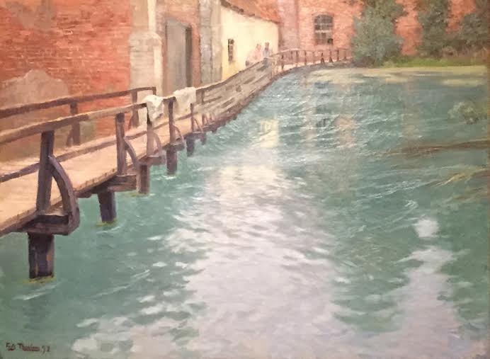
The painting is still on exhibit in the Impressionists collection, and is called "The Mills at Montreuil-sur-Mer, Normandy," by Fritz Thaulow. 

The Mills at Montreuil-sur-Mer, Normandy by Fritz Thaulow, Norwegian, 1847 - 1906.  oil on canvas.  Painting on display at the Mineapolis Institute of Arts.
Although not as impacted by the move to industrialization as Zorn, Thaulow has also worked to preserve cultural values by depicting the mill.  I have always been intrigued by the way in which Thaulow has captured the intense light reflecting off of this water.  Check out the image below without the distraction of the heavy, garish frame, which seems like a disconnect for this particular painting.

The Mills at Montreuil-sur-Mer, Normandy, by Fritz Thaulow, 1981; oil on canvas.  Click on image to enlarge. 
Notice how Thaulow has depicted the ripples and the undercurrent in this relatively still water....fascinating.  It is unfortunate that the mid-section of the water has deteriorated somewhat, and up close the cracks and fracture lines in the painting are distracting.

I wonder what we can to to further preserve this painting, AND all of the works that are currently being created?